
Where to Put Customer Reviews and Testimonials on Your Website (So People Actually Read Them)
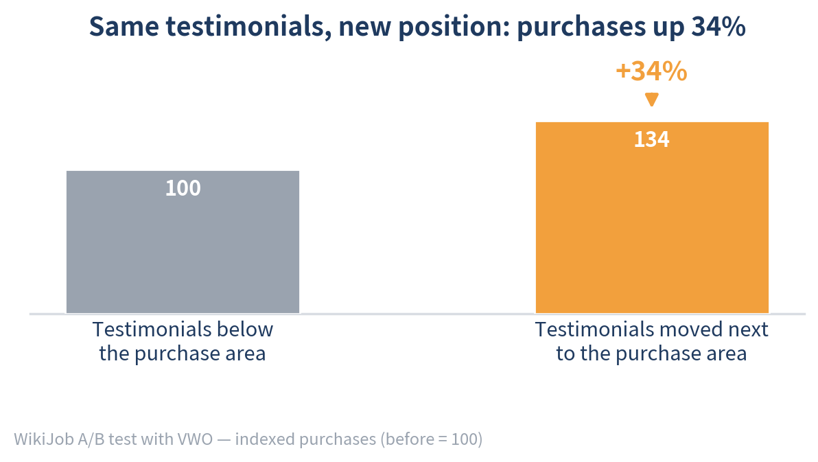
A job-prep website called WikiJob had three short customer testimonials on its sales page, placed well below the purchase area. They weren’t making any measurable difference.
So the team ran a test with VWO. They moved three short testimonials up next to where people buy. Purchases went up 34%.
That’s one site’s result, not a promise for yours. The lesson behind it holds up across the research, though: where a review sits matters as much as what it says.
Most websites show reviews or testimonials somewhere. Far fewer put them where they can help. This guide covers where to place them, which ones to pick, and how to display them. Much of it draws on The Science-Based Playbook for Effective Social Proof by Squarespace Circle and Science Says, which summarizes dozens of academic studies on reviews. We’ve also included a few well-known outside studies, and we’ll tell you which is which.
Why reviews work at all
People look to other people when they’re unsure. That’s the core idea behind social proof, and it’s strongest in two situations:
When visitors feel uncertain, for example “Is this worth the price?” or “Will this actually work for me?”
When the reviewer feels similar to them, for example “She runs a small shop like mine.”
That tells you where reviews belong: at the moments of doubt, featuring people your visitors can relate to.
Rule 1: Put reviews where decisions happen
The most common setup is a “What our clients say” section at the very bottom of the homepage. By the time visitors scroll that far, most have already decided or left.
Place reviews next to the moment of decision instead: beside the button, the price, or the form.
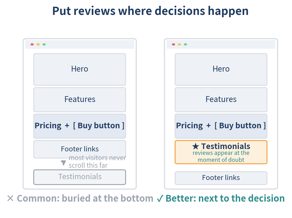
Homepage: A row of three short quotes placed right before or after your main call-to-action section. Client logos can sit just below the hero.
Service or contact page: One named client testimonial with a specific result, right beside the form.
Pricing page: A quote that addresses price hesitation, placed near the sign-up button.
Product page: Star rating and review count next to the price and Add to Cart button, with full reviews further down.
Cart or checkout: Your overall rating and one or two very short reviews near the pay button.
Squarespace tip: Sections are easy to drag around in 7.1. Move your testimonials section so it sits directly above or below the section that holds your main button or form.
Rule 2: On your main pages, show three reviews and lead with your best
Adding more reviews feels like it should help. It often doesn’t.
Research on persuasion (Shu & Carlson, 2014) found that three positive claims tend to be the sweet spot. At four or more, people start to feel sold to and get more skeptical. That study looked at marketing claims in general rather than reviews. The playbook applies it to reviews, and three is a sensible default for a homepage or sales page.
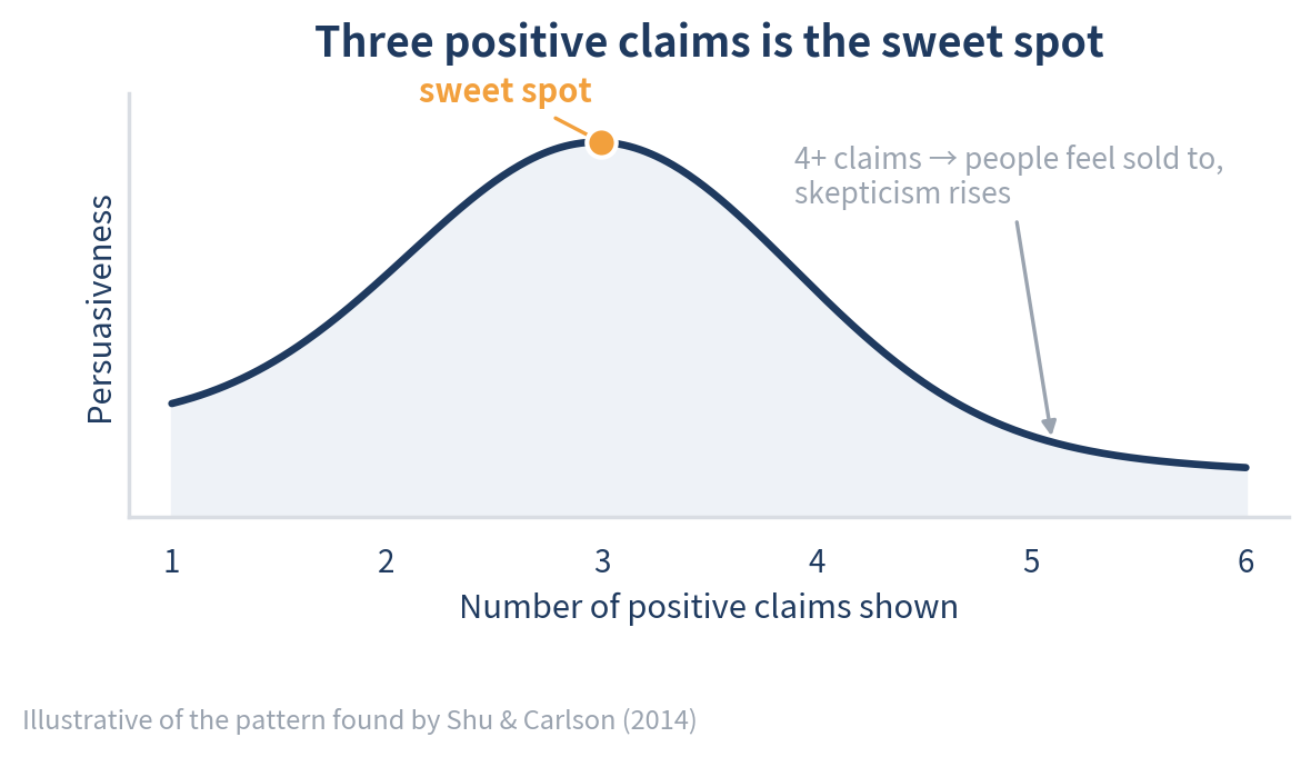
Pick three that cover different benefits, such as friendly service, fast results, and an easy process. Three reviews that all say “great service!” read like the same review three times.
Put your strongest, most detailed review first. The first review people see shapes how they read the rest. In a study of review lists on product pages (Vana & Lambrecht, 2021), sales were up to 84% higher when the first review shown was 5 stars rather than 1 star. That research measured the first review in a product-page list, not a homepage testimonial row. The principle still carries over: the first quote sets the tone for everything after it.
Don’t over-polish. You can’t invent a 4-star review, and you shouldn’t. You can choose a real review that mentions a small hiccup or an early doubt, even if it’s 5 stars. Honest imperfections make everything around them more believable.
Never write or plant a negative review. A made-up complaint is a fake review. If you have a full reviews page, leave the occasional real criticism in place rather than hiding it. A perfectly spotless record is one of the things that makes visitors suspicious.
Rule 3: Skip the auto-rotating carousel
Sliders are one of the most popular ways to show reviews, and there’s little evidence they work.
The best-known data comes from Erik Runyon at the University of Notre Dame, who tracked clicks on the university’s homepage feature carousel. About 1% of visitors clicked it, and most of those clicks went to the first slide. That study wasn’t about reviews specifically. Usability research points the same way, though: people tend to tune out content that rotates on its own.
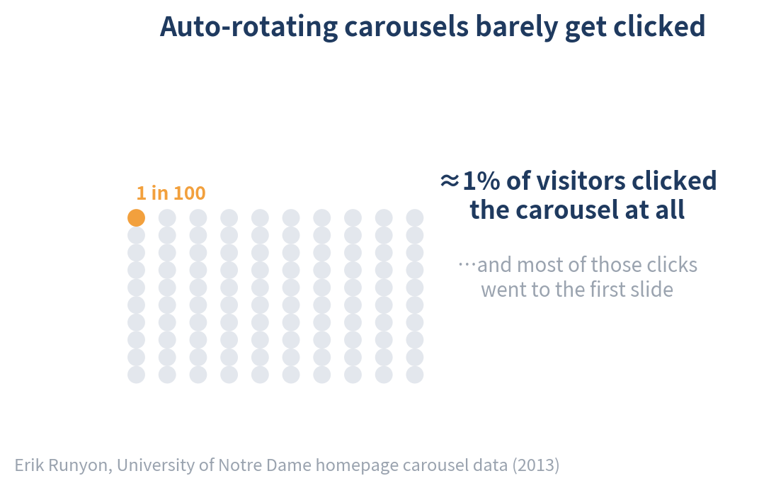
A review slider has the same weakness. Visitors see the first review and rarely click through to the others.
Squarespace tip: When you add a testimonials section in 7.1, choose a simple list or grid layout instead of a carousel or slideshow. Three reviews visible at once beat ten hidden behind arrows.
Rule 4: Put a real person behind every review
An anonymous quote is easy to ignore. A real person is much harder to dismiss.
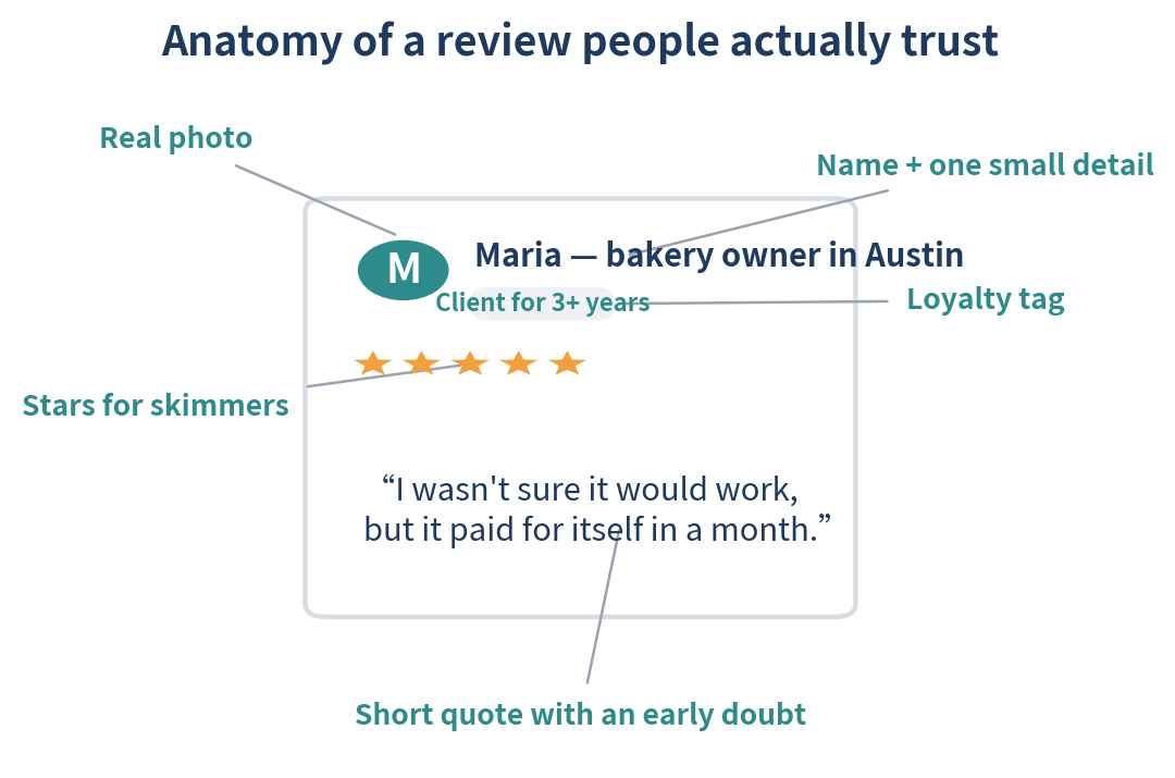
Add a photo. Reviews shown with a profile image are rated more helpful (Karimi & Wang, 2017), and eye-tracking research from CXL found testimonials with photos are more memorable. The photo doesn’t have to be a face. A pet photo works for a dog groomer, as long as it’s relevant.
Add a name and one small detail, such as “Maria, bakery owner in Austin.” Always check with the reviewer before publishing personal details.
Show loyalty when you have it. Reviews from long-time customers are judged as more helpful (Hagen & O’Brien, 2024), so a tag like “Client for 3+ years” is worth adding.
Skip “Verified” badges you made yourself. Research suggests a badge the business adds itself can look like an attempt to steer opinion (Mardumyan & Siret, 2023). Badges that clearly name an outside review source, like Google or Trustpilot, are fine.
Make it easy to read. People glance at stars but spend their time on the words. Use good contrast, left-aligned text, and short quotes.
Rule 5: Pick reviews that say the right things
When you’re choosing between several good reviews, the playbook highlights a few qualities that research links to more persuasive ones:
An early doubt that turns positive, such as “I wasn’t sure it would work, but…”
A comparison with something the reviewer tried before, such as “so much easier than the last builder I used”
Talking to the reader with “you’ll love…” rather than only “I liked…”
Confident wording like “always” and “definitely,” rather than “kind of” or “I guess”
One or two standout benefits rather than a long list of everything
Genuine enthusiasm, even mild swearing. One study found that reviews containing a mild swear word, like “damn good support,” were rated more useful. Leave them uncensored if you use them, and skip anything aggressive.
Each of these comes from a separate study, measured in its own way. Use them as tie-breakers when choosing between good reviews, not as guaranteed boosts.
Two more choices depend on what you sell:
Match the emotion to the offer. For things people buy for enjoyment, like travel, events, or treats, emotional reviews work well. For practical services, like accounting, repairs, or software, choose reviews built on facts with a light touch of feeling (“it worked flawlessly”).
Match the reviewer to the offer. For complex services that are hard to judge, a testimonial from an expert carries more weight. For simple, easy-to-judge offers, reviews from everyday customers are more relatable.
Rule 6: Use video reviews only when they’re needed
Video helps most when your offer is complex and hard to explain. For simple offers, it can add friction without adding anything useful.
The playbook bases this on a 2026 working paper that hasn’t been peer-reviewed yet and studied YouTube product reviews. Treat it as a good hint rather than settled science.
If you do use a video testimonial, keep it short and well lit. Ask your client to speak directly to the viewer and share one specific moment.
How many reviews do you actually need?
Five is the tipping point for products. Northwestern’s Spiegel Research Center, working with PowerReviews data, found that a product with five reviews was about 270% more likely to be purchased than one with none. The biggest gains came from those first few reviews.
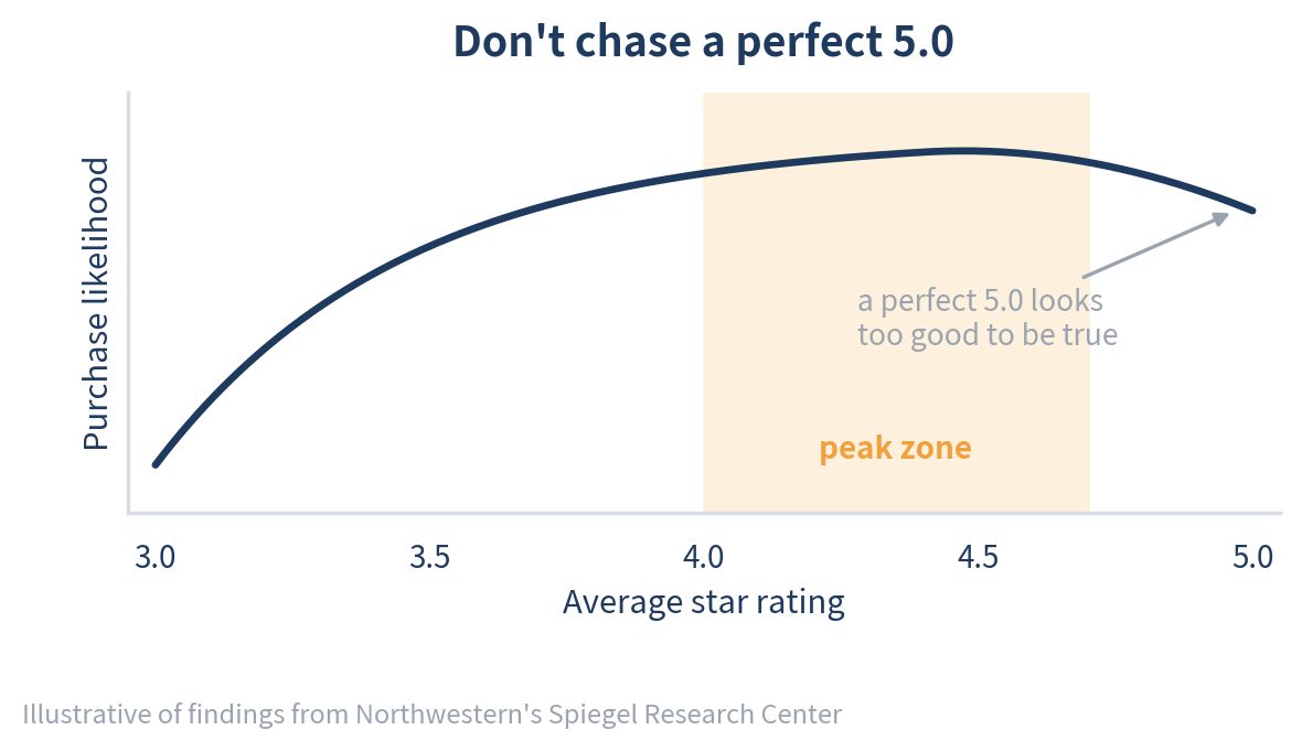
Don’t chase a perfect 5.0. Spiegel also found that purchase likelihood peaked for products averaging around 4.0–4.7 stars and dipped as ratings approached a perfect 5.
Local businesses face a higher bar. This one is a consumer survey rather than an experiment. The BrightLocal Local Consumer Review Survey 2026 found that nearly half of consumers won’t consider a local business with fewer than 20 reviews.
Just starting out? The playbook suggests two stand-ins while your reviews build up. First, share an optimistic goal, like “We’ll help 500 businesses launch this year.” A field experiment found that announcing expected growth helped attract early customers (Boudreau, 2021). Second, show a view or visitor count once it’s meaningful.
Be careful with small numbers, though. Showing “3 reviews” or “12 likes” can make you look less popular. Wait until the number helps you.
Bonus: How to get better reviews in the first place
Great placement can’t fix weak reviews. When you ask for them:
Ask whether they’d recommend you. Reviews phrased as “I’d recommend…” are more persuasive than “I liked it” (Packard & Berger, 2017). Keep the ask neutral, too. Review requests that fish for praise, like “If you loved working with us…”, were found to hurt customer loyalty (Koukova et al., 2023).
Don’t ask right away. The playbook recommends waiting about 10–12 days after the project or purchase, and longer for things that take time to judge, like skincare or coaching. Field experiments found that immediate requests led to fewer reviews, while later ones helped (Jung et al., 2022).
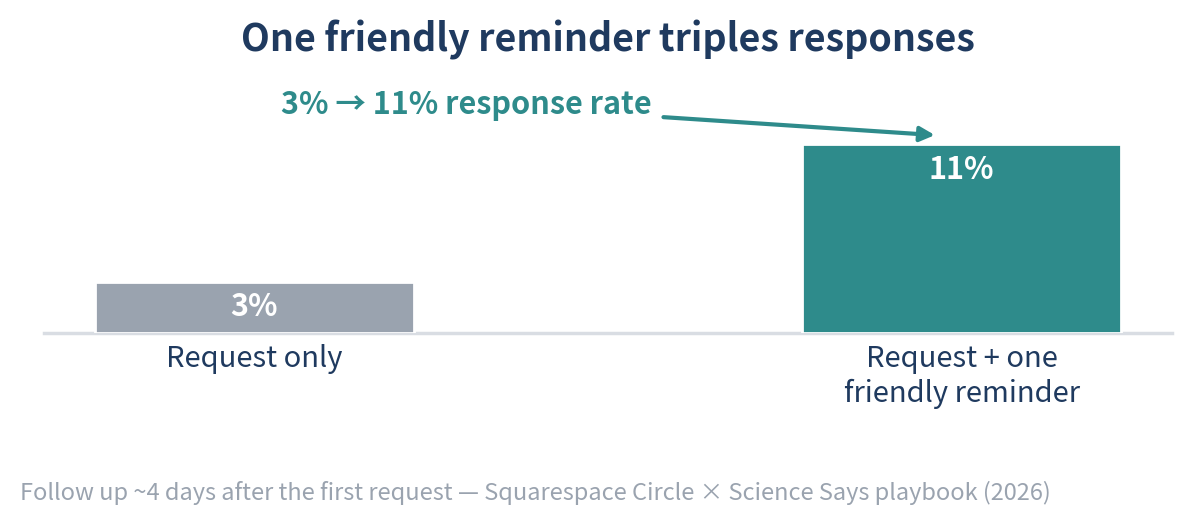
Send one friendly reminder. The playbook suggests following up about four days after your first request and reports that a reminder raised response rates from 3% to 11%.
Send requests Monday to Thursday. A large study found that reviews written on weekends and holidays rate slightly lower on average (Bayerl et al., 2025). It’s a small effect, but an easy one to avoid.
Your quick review checklist
☐ Reviews sit next to your main button, form, or price, not only in the footer
☐ Three real, handpicked reviews on your main pages, strongest first
☐ At least one review that mentions an early doubt or a small hiccup
☐ A grid or list layout, not an auto-rotating carousel
☐ A photo, name, and one approved detail on every review
☐ No “Verified” badges you made yourself
☐ Video reviews only if your offer is complex
☐ A neutral “would you recommend us?” request, sent 10–12 days after each project
Want to go deeper? Squarespace and Science Says published the full research behind many of these tips: 36 recommendations on choosing, displaying, and asking for reviews. Read the Science-Based Playbook for Effective Social Proof here.
A quick note on review statistics
Search this topic and you’ll find bold claims like “video testimonials increase conversions by 80%.” Many of these trace back to a single old test, the wrong source, or nothing at all, so we’ve left them out.
The numbers we did include come from named sources. Most are academic studies summarized in the Squarespace Circle playbook. The WikiJob test, the Notre Dame carousel data, the Spiegel research, and the BrightLocal survey are separate public sources. They were each measured in different settings, so treat them as strong starting points rather than guarantees. The best way to know what works for your audience is to test it on your own site.
Sources: Squarespace Circle × Science Says, “The Science-Based Playbook for Effective Social Proof” (2026), which summarizes the studies by Shu & Carlson (2014), Vana & Lambrecht (2021), Karimi & Wang (2017), Hagen & O’Brien (2024), Mardumyan & Siret (2023), Boudreau (2021), Packard & Berger (2017), Koukova et al. (2023), Jung et al. (2022), Brandes, Godes & Mayzlin (2021), and Bayerl et al. (2025) cited above. Also referenced: VWO WikiJob case study; Erik Runyon, University of Notre Dame carousel data (2013); Spiegel Research Center, Northwestern University; BrightLocal Local Consumer Review Survey 2026; CXL eye-tracking research; Nielsen Norman Group.